Blog or Wiki Design
How would you design and manage content in a blog? Use your blog experiences so far?
After spending a few weeks blogging for this subject, I must say I have enjoyed the experience.
I find blogging an efficient and satisfying way to respond to tasks, organise ideas and link to others within the subject group.
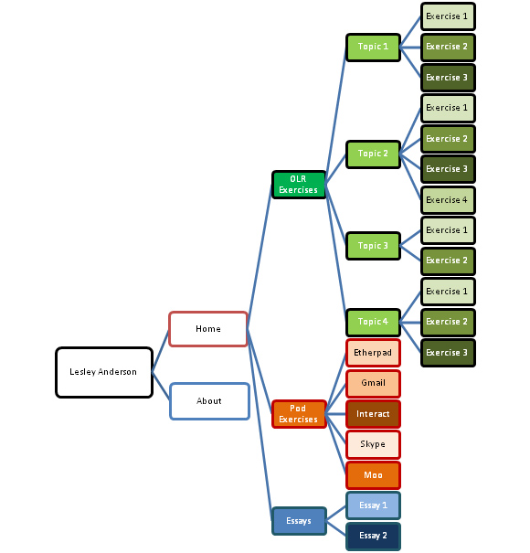
The first thing I did was plot out the structure of my blog site. I have only included 2 separate pages in my blog - About and Home. About contains a short piece of information about myself and the Home page is where my recent postings appear. I have relied on categories for the major method of organisation of my posts, and find that works well for me. I have major categories organised with sub-categories as follows -

This is the initial plan for my blog
Exercises for each topic have separate headings and postings but are linked to their topic number. All topics are linked to the main category of OLR Exercises.
Pod Exercises are listedin order of weekly appearance - as our subject tries out different avenues for collaboration, I have reported on them and posted the reports to my blog.
Essays will also be included in their order of appearance.
I have tried to keep my blog site one that is interesting but not way out. I have done some reading and many contributors to blogging tips consider that reverse text - light text on a black background, is probably not a good way to go and perhaps not as easy to read as dark text on a white background but, personally I simply liked the look of the particular design. I have actually lightened the grey colour of the text as I found the colour that is with the template was not enough of a contrast to the background. I also decided to change the colour of the topic headings. In the original template these are a dark grey also, although in a bolder style. I wanted a little interesting, eye-catching colour so decided that yellow on the black background would be ideal. Hyperlinks stand out well in this template - being a turquoise blue. I find that colour a nice relief from the darkness of the template.
This organisation allows for easy addition of categories if required as the course moves forward and have the need to expand the list. I like the way the list of categories appears in order on the Home page and this allows easy access to postings for myself, if I want to reread my previous posts, or a visitor who may be looking for a particular posting.
I tend to be a minimalist, so have not added too many widgets to my blog. The template comes with 12 widgets but I chose to include only 5 of them as I wanted to leave my Home page as uncluttered as possible. The idea of a calendar appealed to me - I like to be able to look at a page and know the date with a single glance - without having to go searching for it. I have included a list of my most recent posts and one that includes my categories. I have also included a blog roll which links to the blogs of a few other students in the subject whom I am in contact with as well as members of Red pod - my assigned pod for the subject. The final widget I included was a tag cloud and I have found it fascinating to see where the emphasis lays in my posts as it comes through in my tags.

Brian
February 6th, 2015 at 23:51
armpits@roads.legendary” rel=”nofollow”>.…
ñïñ çà èíôó!!…
Walter
February 7th, 2015 at 00:24
estherson@scenes.miserably” rel=”nofollow”>.…
ñïàñèáî!!…
kenneth
February 9th, 2015 at 23:27
leninism@portsmouth.rembrandts” rel=”nofollow”>.…
ñïàñèáî çà èíôó….
jim
February 10th, 2015 at 12:39
palermo@constantine.hovel” rel=”nofollow”>.…
ñïñ!…