Social networks case study
Who is following who? Exmaine the blogs in your POD and
work out the map of Followers/Following relationship.

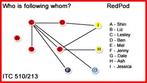
This Social Networking diagram shows the group of followers of the blogs belonging to RedPod. It is colour coded according to the Pods all followers belong to.
Assign each person a letter in the same order as they appear in the dialogue as a, b, c .. etc.
For your chosen extract, draw the social network diagram and build the same matrix of 0 and 1’s as per figure 1. Descibe any patterns of people’s interactions that you discover.
If you were to repeat this analysis on another set of blogs from another POD,
would you find the same patterns?
Why or why not? [HINT - changes in context and process may be just some variables to consider]
Support you opinion with any of the reference provided or with others you find.
|
A |
Mel |
|
B |
Lesley |
|
C |
Ben |
|
D |
Liz |
|
|
A |
B |
C |
D |
|
A |
0 |
1 |
1 |
1 |
|
B |
1 |
0 |
1 |
1 |
|
C |
1 |
1 |
0 |
1 |
|
D |
1 |
1 |
1 |
0 |
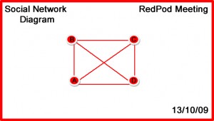
The RedPod meeting that this dialogue was extracted from and from which the data was extracted was certainly full on. In fact most of the meetings our Pod has held have been the same. I did notice, as I looked over the dialogue that we talk about a lot of other things besides the task at hand but there seems to have been great discussion about what we have been doing, how we are doing it and what we have achieved. This discussion was highly motivated too All members contributing at some stage, to the discussion, is reflected in the table above. We all talked to each other at some stage of the conversation. The diagram is fairly mundane as is the table.
One thing, these items don’t show is ‘how much’ each member of the group contributes to dialogue and conversation. Perhaps a diagram with weighted edges as suggested by Hallinan[i] in the second of her lectures - “Networks” would better do that? Weighting or colour coding edges could certainly aid in showing which members of the group were most actively engaged during discussion and interaction.
The type of dialogue is not reflected - agreement or disagreement, questioning or explanatory, or reveal relationships between group members. Tone certainly is not evident and that is difficult to gauge from text alone - unless it is obvious that someone is unhappy with what is going on in a discussion and expresses it adequately.
The way I have displayed my social networking diagram is not indicative of the direction of conversation either. It basically makes the statement that at some stage during the conversation person A spoke to person B. Having the table in front of you helps a little - in this case we know that person B did speak to person A but we don’t know where in the conversation this occurred.
There are certainly factors that I believed influenced this and other of our Pod discussions.
The timing of our meeting - we had not yet started with our pod work and had had a few hiccups with how we would approach the work and workload in order to fulfil the requirements of the task set for us.
With a general feeling of urgency and need to complete work within a time frame it is much easier to get discussion happening and keep it on track.
Time zone differences - we had to make the most of the time when we were all able to get together to discuss things as one of our members is one and a half hours behind us. Not that it has caused any real problems, but I do think it makes us frugal with the time we have together.
The nature of the work - knowing that this is assessment material also helps to keep us efficient with our meeting times and stay relevant to the goal we are trying to achieve.
Size of the group - only four members discussing things over distance, makes the discussion much more productive and makes all the data look neat and tidy - there’s really not that much to handle.
If these restraints and pressures from outside the group were not there, if we had unlimited amounts of time to work together and get our task finished, if we had to communicate across a huge group of people over distance and were not all working toward a common goal, things might well be different. Kirshbaum[ii] talks about complex systems as being self organising - they adjust naturally to increase their efficiency and effectiveness, in response to so many stimuli from the environment around them as well as being affected by the nonlinear change that happens within them. It is amazing that all of it occurs without us even realising it.
[i] Hallinan, J 2005, Introduction to Complex Systems, <http://www.itee.uq.edu.au/~comp4001/>, accessed 21 October 2006.
[ii] Kirshbaum, D, 2002, Introduction to Complex Systems, <http://www.calresco.org/intro.htm>, accessed 21 October 2006.
|
A |
Mel |
|
B |
Thomas |
|
C |
Jenny |
|
D |
James |
|
E |
Dylan |
|
F |
Margaret |
|
G |
Lesley |
|
H |
Dale |
|
|
A |
B |
C |
D |
E |
F |
G |
H |
|
A |
0 |
0 |
1 |
1 |
1 |
0 |
1 |
0 |
|
B |
0 |
0 |
1 |
0 |
1 |
0 |
0 |
0 |
|
C |
1 |
0 |
0 |
0 |
1 |
1 |
1 |
1 |
|
D |
0 |
1 |
0 |
0 |
0 |
0 |
0 |
0 |
|
E |
1 |
0 |
1 |
0 |
0 |
0 |
1 |
0 |
|
F |
0 |
0 |
1 |
0 |
0 |
0 |
0 |
0 |
|
G |
1 |
0 |
1 |
0 |
1 |
0 |
0 |
0 |
|
H |
0 |
0 |
1 |
0 |
1 |
0 |
1 |
0 |
I decided to actually take a look at a larger di alogue to compare with my original data.
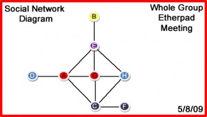
This table and the second Social Networking Diagram have been generated from dialogue from the group’s Etherpad discussion on the 5/8/09 and, even though there is only double the number of members in this discussion excerpt the picture is quite different - in both the table and the diagram. I remember feeling at the time, how disjointed the meeting felt as members of the group came in and left randomly. The table also shows dominance by a couple of the group members and the dialogue actually reflects this - with their names coming up more often in the conversation. It also shows polarising to a certain degree - this was quite early in our semester of work and people were still finding their way, getting to know others and understand how things would work.
